
Nasdaq Records its Largest Point Decline Ever.


Here’s what’s in today’s update:
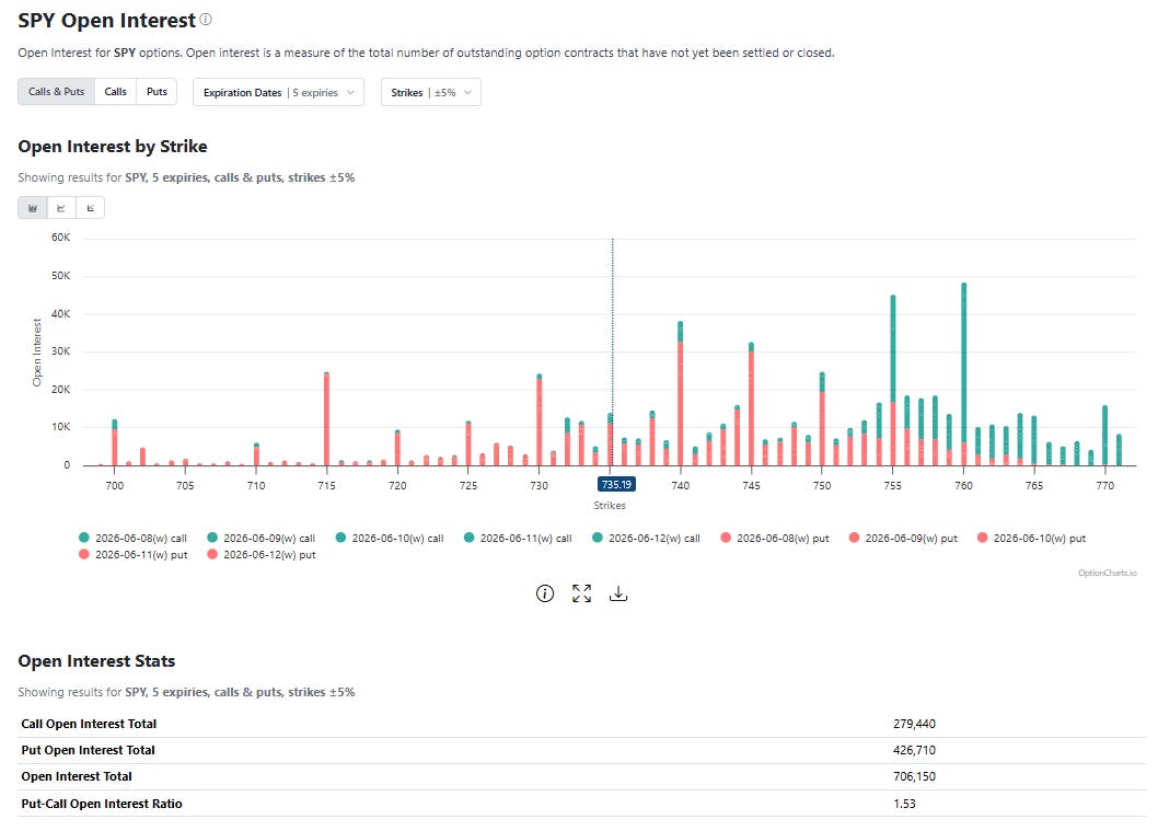
>SPY ETF open interest review of resistance and support
>Proprietary signals for SPY -0.60%↓, QQQ 0.65%↑, VIX, META -0.93%↓, TSLA 2.23%↑, NVDA -1.57%↓, MSFT 0.11%↑, GOOGL 0.90%↑, IWM 0.15%↑, AAPL 0.39%↑, MSTR 3.82%↑, MU -2.20%↓
>The most interesting index option trades of today from large traders/investors
Lastly, if you’re interested in long term individual stock ideas, check out my latest here.
Last weekend I said we just completed nine straight up weeks on the S&P 500, which is quite rare, and that historically the 10th week is lower. Well, we ended the week lower.
Below is the long-term S&P 500 signal I share here, and yesterday it flagged Thursday’s SPX price as peak “high risk”. Some of the other models have been flagging “high risk” since mid-May and what do you know, we’re back to mid-May prices…
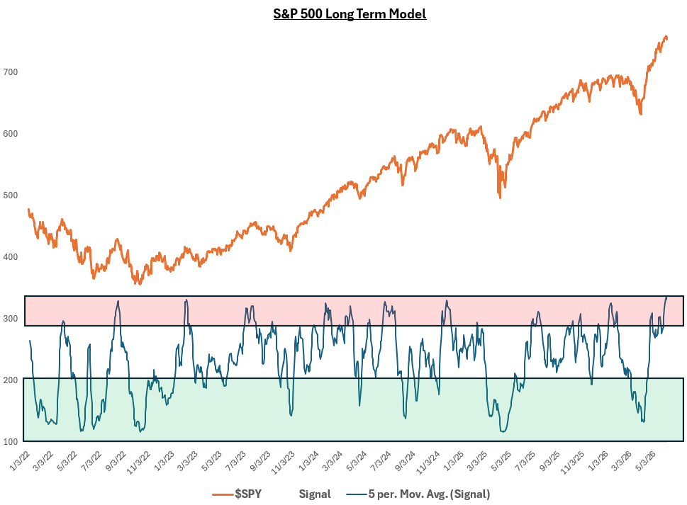
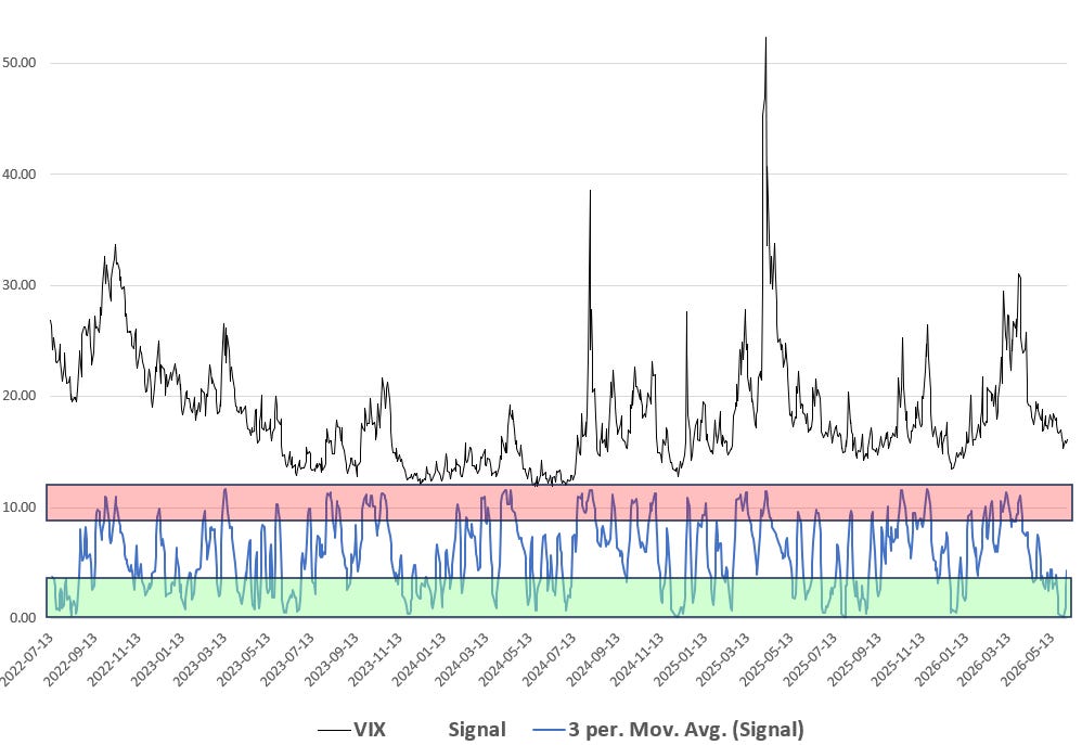
Combine the long-term model risk with the fact that the VIX chart I share below reaching maximum cheap volatility and you have a recipe for a sharp pullback. Some people get anxious when the sell off doesn’t come immediately, but these things require a catalyst, the option data signals are just highlighting that conditions are ripe for the drop (hence “high risk”). Ironically, in the ETF data Thursday folks piled into the ultra-long S&P 500 fund and fled the ultra-short QQQ fund.
As we came into this week, I shared the open interest data below highlighting that open interest was no longer put heavy, which meant it would be easier to have a decline in prices as volatility was not well supplied. Looking forward, if SPY 0.00%↑ can clear $750, bulls have a chance at tapping $760 again, which would be resistance. $755 is also resistance while support is at $730 and then $725.
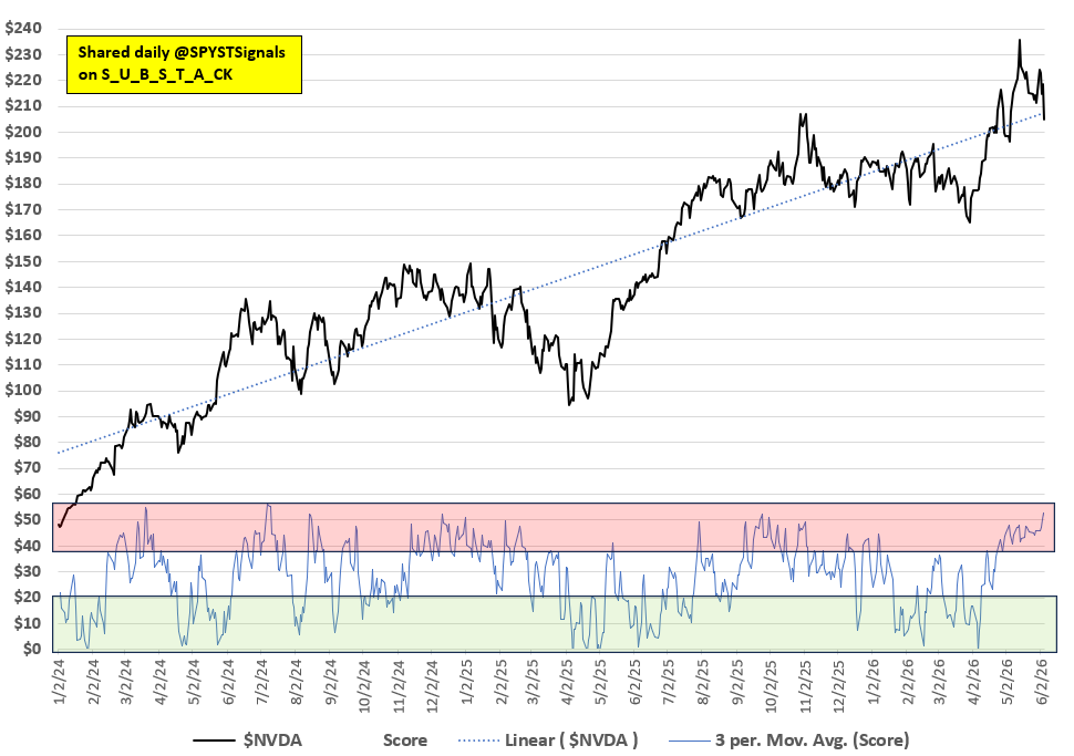
Lastly, one more humble brag. Never doubt my NVDA 0.00%↑ signals. I’ve been a Nvidia whisperer for almost three years now.
Market Signals: I build trading signals optimized for 5 [short-term], 15 [intermediate-term], and 30+ [long-term] trading days. The signals are based on daily option data from the CBOE. The models group option metrics then look at what historically has happened next. Option data is collected from as far back as 2017. The symbols I cover have larger option markets such that the tail can wag the dog (according to Goldman Sachs research). My index models use not only index symbols and the VIX to create a “score” (0% max bullish, 100% max high risk), but the largest stocks in the related index in an effort to capture dispersion trade effects. Green areas of the signal charts are bullish, red areas are high risk. High risk is where declines or sideways action is most likely to occur, but it’s not always bearish. For more details, check out this post.
